Formal Elements

Coursework, Creative Arts 1.1 Experience Creative Arts, Creative Arts BA (Hons), Project 2: Encountering Time - A Critical Analysis, Research & Reflection

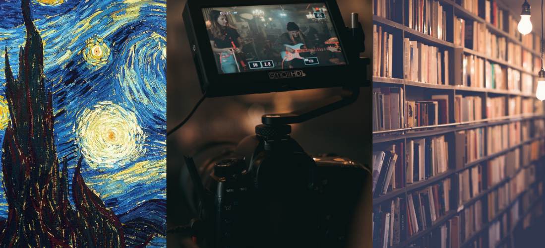
The disciplines I am currently most interested in are art, literature and lens-based media.

Starting Points

Art

  • Colour
  • Form
  • Line
  • Point
  • Scale
  • Shape
  • Space
  • Texture

Lens-based Media

  • Angle
  • Composition
  • Contrast
  • Distance
  • Editing
  • Framing
  • Mise-en-scène
  • Viewpoint

Literature

  • Alliteration
  • Assonance
  • Character
  • Dialogue
  • Imagery
  • Metaphor
  • Narrator
  • Plot
  • Similie

The above are all terms given to us in the course guide. There are some that are interchangeable across disciplines, but none have been repeated. There will be other terms added in my glossary.

Art

Colour

Colour theory as a topic is huge in art. The definition of colour is that it is produced when light hits an object and is reflected back to the eye. The wavelength that is reflected back to the eye determines which colour our brain sees. However, there are many subjective elements to it too. Colours evoke memories to us, they can be seen as warm or cool, some colours complement each other, some have cultural associations.

The Colour Wheel

There are 12 sections on the standard colour wheel. The three primary colours of red, blue and yellow; the three secondary colours are made from the primary: orange, purple and green; finally the six tertiary colours are made from mixing the secondary colours.

The wheel can also be split into warm colours and cool colours. Warm colours are the upper right half and are the colours that seem to be brought forward in a composition. Cool colours on the other hand are the lower left and seem to sink backwards in paintings.

Harmonious colours are those next to each other on the colour wheel, they work together well and seem to be pleasing to view. Contrasting or complementary colours on the other hand are opposite on the wheel and often clash and can create drama when together.

There are three other characteristics of colour:

  • Hue: the colour itself, the distinctive quality by which one can distinguish one colour from another, e.g., red, blue, green, blue. 
  • Value: the brightness of the hue, the quality by which one distinguishes a light colour from a dark one, in the range from white to black.
  • Chroma or intensity: the quality that distinguishes a strong colour from a weak one, the departure of a colour sensation from that of white or gray, the intensity of a colour hue. 

Colours and Emotions

Choices of colour and the relationships between colours have a huge influence on how a piece of art or design looks and feels and the emotions it provokes. Colours have wider social and cultural meanings behind them too which can be used by an artist. For example, red has many different meanings. Often we link red to danger. In western culture, red is often used as a warning sign or to tell you to not do something. In traffic lights, the colour red is used to mean stop. Red can also have a link to anger. Cartoons or movies may show a character going red in the face when getting upset. It can also mean embarrassment. Red can also have positive associations. We link red with love and passion – it appears all over Valentine’s cards in February. We also see red as a festive colour – the colour of Christmas and Santa Claus. Different cultures treat colours very differently, however. In China, red is seen as a lucky colour. In South Africa, red is seen as the colour of death and mourning (which is normally associated with black in the United Kingdom). The use and meaning of colour can vary depending on where artists and their audiences come from.


Form

Form describes three-dimensional objects. It can describe how a sculpture forms a three-dimensional object in space. Form can also describe the illusion of how three-dimensional form is conveyed through the use of lighting and shadows, and the rendering of value and tone. Two-dimensional work can suggest three-dimensional objects by including implied forms. This means that lines or shapes are shown in a way that suggests they have depth. This can be done using perspective or through tone or colour effects.

Form can be either geometric or organic. Geometric is mathematical objects such as cubes, pyramids and spheres, they give a man-made appearance and can suggest solidity, balance and permanence. Organic forms look natural. They are irregular and may seem flowing and unpredictable. The most obvious example of organic forms is realistic representations of the natural world or living things, but they do not have to be realistic to be organic. Some designs combine geometric and organic forms.

Forms have mass. The mass of a form is a result of its size and the material it is made from. The greater the mass the heavier a form is. The appearance of an object can change how heavy it looks – its perceived mass. For example, darker and more intense colours or more detailed textures tend to appear heavier.


Line

 Line is considered by many to be the most basic element of art. In terms of art, a line is considered “a moving dot”. Line has an endless number of uses in the creation of both drawings and paintings. Although we typically associate line with drawing, it’s also foundational to painting as they reveal the artist’s techniques.

Perhaps the most obvious use of line is when it is used to define the edges or boundaries of a subject. We can obviously communicate a subject’s edges by using lines. In most cases, when we begin a drawing, we start by drawing the outlines of the subject. The outlines are just the beginning since the line is also used to describe the details on the subject as well. Usually, we can simplify areas of contrast on a subject into a line.

Line can also suggest movement, mood, emotions and ideas.

Orientation refers to the direction of lines. They could be vertical, horizontal or diagonal. Lines can be used in art and design to help guide your eye around a painting or to create a sense of balance and structure. Deliberate use of horizontal, vertical and diagonal lines can help to create a focal point. They can also help to suggest depth and a sense of perspective.


Point

Point can refer to the focal point of a piece of work. It is a key point of interest in your painting that you want to direct attention towards. It should be your most interesting point in the painting. It is possible to have more than one focal point but there is usually one strong point where the focus and attention is.


Scale

In art and design, the principle of scale refers to the relative size of one object compared to another, typically the size of the artwork to the viewer’s body. Scale can also refer to the size relationships of different visuals within a singular piece of art.


Shape

In the study of art, a shape is an enclosed space, a bounded two-dimensional form that has both length and width. Shapes are one of the seven elements of art, the building blocks that artists use to create images on canvas and in our minds. A shape’s boundaries are defined by other elements of art such as lines, values, colours, and textures; and by adding value you can turn a shape into an illusion of its three-dimensional cousin, form. As an artist or someone who appreciates art, it’s important to fully understand how shapes are used.

Like with form, shapes can be geometric or organic.


Space

Space, as one of the classic seven elements of art, refers to the distances or areas around, between, and within components of a piece. Space can be positive or negative, open or closed, shallow or deep, real or implied, and two-dimensional or three-dimensional. Three-dimensional work creates real space. Two-dimensional works can create implied space using various techniques. 


Texture

Texture is used to describe the way a three-dimensional work actually feels when touched. In two-dimensional work, such as painting, it may refer to the visual “feel” of a piece. Many artists use texture to show their technique and to express emotion.


Tone and Value

As an element of art, tone or value refers to the visible lightness or darkness of a colour. Tones could refer to black, white and grey tones between. It could refer to how light or dark a colour appears. In real life, the tone is created by the way light falls on an object.

Two-dimensional artworks cannot show real form. The illusion of form can be created by using different tones that suggest different amounts of light hitting the subjects shown. This can fool the eye into seeing a three-dimensional object.

Tone can be used to create an atmosphere in art and design work. Different atmospheres will be created depending on the value and contrast of the tones used. A small amount of contrast tends to result in a calmer image, whereas high contrast creates drama. The term chiaroscuro is used to describe images with very high contrast.

Tone can also indicate depth and distance in artwork and artists can create focal points at different places in their work.

Lens-based media

Angle

Camera angles, and the degree of those angles, can totally change the meaning of a shot.

Eye-level shots

In an eye-level shot, the camera is positioned at the same level as the actors’ faces which gives it a sense of immediacy and realism. In everyday life, we see most other people at eye level and this shot type is often used when filmmakers want us to feel part of a scene.

Low-angle shots

Using a low angle shot is an effective way to establish a character’s importance in a scene as they make characters look powerful and imposing.

High-angle shots

Here the camera is above the object or actor being filmed and is pointed down at them. High angle shots make characters and objects seem smaller. High angles can also work to make characters seem weaker or more vulnerable.

Worm’s eye view

This is an extreme low-angle shot in which the camera is very far below the subject and pointed upwards. This angle exaggerates the scale of the shot’s subject and can make actors seem like imposing giants.

Bird’s eye view

Sometimes called an overhead shot, this camera angle places us directly above the subject. The Bird’s eye view can be used to show us action that might not be visible from eye level.

Dutch angle

For a Dutch angle, the camera is slanted to one side. With the horizon lines tilted in this way, you can create a sense of disorientation, a de-stabilized mental state, or increase the tension.


Composition

Composition is important in photography and art. It links to viewpoint and framing and it is also important to consider the other formal elements of art such as line, shape and balance. Composition refers to the positioning or arrangement of people, objects and landscapes in the frame. Good composition can enhance the meaning of an image.

Leading lines are a useful compositional tool. A viewer’s eyes tend to look for lines and follow them from one end to the other. The effect is particularly strong when different lines come together.


Contrast

Contrast can mean many things in photography and film.

One way to add interesting contrast is to use sections of black and white. Working in black and white can draw attention to light and tones, shapes and textures.


Editing

Editing can be done in both film and photography. A well-crafted edit can create meaning and take audiences on emotional journeys. Simple editing of photographs can include cropping the image or removing errors and minor blemishes like dust spots. Underexposed areas can be lightened and washed out areas can be made to appear darker. This can be done quickly and easily. It is also possible to make more significant changes to an image. This can be used for artistic or experimental effects. For example, you might change the contrast, increase or decrease colour saturation, add blurring or mix areas of black and white and colour.

In film, at its simplest editing can remove bad takes and shorten sequences, but when filmmakers fully harness its power they can create meaning where none existed and take audiences on emotional journeys.

Continuity editing

The most common form of editing is continuity editing. In this editing style, shots from different angles are cut together to create a sense of continuous movement and continuity. This creates the impression that time and space remain consistent within the scene, even if the shots have been filmed at different times. A key aim of this style is to ensure that no single cut calls attention to itself and that nothing strikes the viewer as confusing or inconsistent. When continuity editing is applied correctly we may not notice the individual cuts.

Montage editing

The main alternative to continuity editing is montage editing. Montage editing can be used to create excitement, terror or startling new meanings. Instead of allowing shots to flow smoothly from one to another, montage editing juxtaposes images for effect and can cut rapidly from wide shots to extreme close-ups. Montage editing draws attention to itself in ways continuity editing does not.

Other editing techniques

Cross Cutting

This is used to cut between two different actions happening at the same time. By cutting back and forth between these different events, the director can establish that they are somehow linked.

Freeze Frame

This highlights an important moment by creating a pause effect in which a single frame of film is extended for several seconds.

Slow motion

These effects are usually captured by the camera by changing the filming speed but can also be achieved in post-production by slowing individual shots down. This can help emphasise special moments or draw out actions to generate suspense.


Distance and Framing

Framing a camera shot can make audiences feel more connected to the story you are telling. You can alter the frame by placing the camera closer or further away from the action being filmed.

Close up

A close-up shot shows us a character or object at close range. A director might choose to show an actor in a close-up so that the audience can properly see their face. This allows viewers to see the character’s facial expressions and gives them a clue as to how the character is feeling emotionally. A director might also use a close-up of an object so that we can see its importance. Extreme close-ups can be used to build tension or add extra emotion to a scene.

Medium shot

A medium shot, sometimes called a mid-shot, is a shot taken from the middle distance. A medium shot of an actor won’t show us their face in the same level of detail as a close-up but it will let us see more of their body and surroundings. Medium shots of actors are often framed from the waist upwards and that combination of distance and framing allows us to see both a character’s face and their body language.

Long shot

A long shot, sometimes also known as a wide shot, takes us far away from the character being framed. This gives the audience much more information about the scene in general and puts the actor in context, as we usually see them in the middle of a landscape or busy environment.

Thinking about where objects and people are in the frame itself is crucial. If a character is important in a scene, a shot might place them in the centre of the frame. If two characters are drifting apart, one way to show that might be to position them at opposite ends of the frame. One specific tool film-makers sometimes use to help with framing is the Rule of Thirds. The Rule of Thirds is an approach to framing which divides the frame into three sections across the horizontal and vertical lines. Placing actors, edges of objects or the line of the horizon on these imaginary lines makes it easier to create balanced and pleasant compositions.


Mise-en-scène

Mise-en-scène is how all the aspects of a film combine to create a convincing world on screen. It involves everything you can see on a screen or in an image including props, costumes, make-up, location, set, performance and animation.


Viewpoint

Viewpoint links to composition and angles. The distance your subject is to the camera can change how much of the frame it fills, how its scale compares to its surroundings and how flat or deep the image will appear.

Directors can also change the viewpoint by moving the camera during filming a sequence.

Pans

In a panning shot, or pan, the camera is locked onto a tripod and the tripod is fixed in one spot. The tripod head, which the camera rests on, is pivoted from left to right or right to left. The effect is much like standing in one place and looking from side to side. Panning is often used to follow action such as a character moving from one spot to another. Panning shots can also be used to establish locations, slowly revealing information about a place as we take it in.

Tilts

A tilt is similar to a pan in that the camera is also fixed to a tripod. However, instead of pivoting from left to right, the camera is tilted up or down. Tilts can be used to follow the action. If a character on screen was climbing a ladder, the director might use a low angled tilt to follow them as they move upwards. Tilts can also be used to tell us a little bit more about a location than a single, static shot might.

Tracking shot

In a tracking shot, the camera is placed on a moving platform or vehicle so that we can follow alongside the action. Nowadays, tracking shots can also be achieved by using Steadicams. A Steadicam is a self-balancing camera rig that is attached by a harness to the camera operator. When a Steadicam operator moves, the camera moves with them creating a smooth gliding motion.

Handheld camera

In a handheld shot, the camera is carried by the camera operator. Because this technique gives scenes a bumpy and unpolished feeling it is often used by directors when they want viewers to feel embedded in the action of a scene.

Crane shots

In a crane shot, the camera is mounted to a crane and can move up or down. Crane shots are usually used for dramatic effect, making us feel as if we are swooping over a location or diving down from above.

Zoom shots

A shot that uses the zoom lens to suddenly push us closer to or further away from a subject is called a zoom. Zooms can be effective if used creatively but can also seem amateurish and distracting if overused.

Aerial shots

In an aerial shot, the camera is mounted to a flying vehicle and flown over the action or location. Aerial shots are often used at the start of a film to establish the setting and create a sense of mood.

Literature

Alliteration

Alliteration is when words start with the same letter and, more importantly, the same sound. It can be used to create a mood or for emphasis. Alliteration can build a mood or set the scene depending on the letters that are used:

  • The gentle ‘w’ sounds in “whispering wind” create a soft and airy mood.
  • The harsh ‘r’ sounds in “raging river rapids” help the reader to imagine the brute force of the water.

Alliteration can also be used to capture the reader’s attention and reinforce a point.


Assonance

Assonance is a technique similar to alliteration but where the same vowel sound repeats in a group of words. For example, “It beats . . . as it sweeps . . . as it cleans!”

Assonance is a method of achieving emphasis and cohesion in a short stretch of text.


Character

Characters in texts are developed through what they say and do, and the language used to describe them. There is explicit characterisation and implied characterisation. The character is built up through description, dialogue, how other characters see them, behaviourisms.

Characters usually change over the course of a text. These changes can be a powerful way to present themes and important ideas to the reader. As the text continues, the author often adds more details to the picture of a character. How the reader reacts to a character can be very important to how they feel about the text. There should be contrasts or contradictions – not just between characters, but within each character. In real life, no one is simply good or bad. All effective characters have more than one side.


Dialogue

Dialogue is a conversation between two or more characters in a literary work. It could also be an inner dialogue which is a character’s internal voice. Dialogue is essential for several reasons. First, it creates characterisation. In fact, it is one of the four main methods of characterisation. The audience learns much about a character through his speech. Second, dialogue advances the plot. Interactions within, between, or among characters help to give insight into the storyline. Additionally, well-written dialogue makes a text realistic. In the real world, people interact and have conversations. This is critical to a successful text.


Imagery

Imagery is the use of language and symbolism in writing which make our five senses active. The word ‘imagery’ gives rise to the creation of mental images and figures. The imagery brings to life the characters of the story through the mental pictures of the readers. These are effective devices used by the authors to create these effects.

Visual

Visual imagery is the one where the author uses various visual qualities to create imagery. This can include various shapes, sizes, colours, lights, shadows, and patterns. This is the most common form of imagery that is used in literature. Whenever the term imagery is used people understand visual imagery in literature. They generally use metaphor and simile to create visual imagery.

Auditory

Auditory Imagery creates an appeal to the reader’s sense of hearing. Creating auditory imagery through writing is not that easy. For instance, creating imageries by author by creating sounds of war in a war novel. Onomatopoeia is mostly used by authors to create auditory imagery.

Gustatory and Olfactory

Gustatory imagery is the one that appeals to the taste of the readers. This is generally used to depict the food as the character eats it. This may create a sense of gustatory imagery when the readers read about a portion of food. Olfactory Imagery is the imagery when the author tries to attract the reader’s taste or smell. It helps in depicting the situation through which the characters of the narrative are going through or experiencing. The smell of fresh rain, the smell of fire are some of the examples of olfactory imagery.

Tactile

Tactile Imagery is the one that creates a sensory effect of touch through text or the writing of the authors. This is used to convey how some things feel when touched. It may be used to convey the sense of texture, temperature, wetness, dryness, and so on. They help in creating empathy for the characters in a narrative.

Kinaesthetic

Kinaesthetic Imagery is the one that is used to give a sense of motion by the author. Speed, slowness, falling, or even fighting can be depicted with the use of Kineasthetic imagery. Kinaesthetic imagery is very relevant in the era of action movies and screenplays. It also gives a good feel when needed to write about sports, driving, and other actions.

Organic

Organic Imagery is a type of imagery that appeals to the most traditional forms of our senses. They are the feeling of hunger, fatigue, fear, and even emotion. They form the basic tenets of human emotions. It moves the readers to the feelings of either joy or sadness. When they are written efficaciously creates intense sorrow and desperateness which the readers can feel immensely.


Metaphor

A metaphor is a figure of speech that describes something by saying it is something else. It’s not actually true but it gives the reader a clearer idea of what it is like. For example, “They were peas in a pod.” Extended metaphors are metaphors that run throughout a piece of work.


Narrator

Voice means the tone of the narrative. Think about the language used in the narration and what that tells us. In some texts, the narrator is also a character. In others, the narrative voice is more distant. Narrative can be first-person – indicating a clear point of view – or third person – which could follow one character closely or take an omniscient standpoint.


Plot

The plot is the series of events that comprise a story’s main action. It is typically made up of a sequence of individual but connected elements that compels the main character(s) to embark on a journey. This journey can be physically or mentally and emotionally in nature, though it is often both. The plot’s primary journey leads to a climactic event and a resolution. Most plotlines follow the same basic structure made of five essential ingredients.

Exposition

A story begins by introducing the protagonist and other key characters, their inter- and intra-relationships, the setting, and relevant background information. In this section, the protagonist discovers their main goal, typically a problem that needs surmounting.

Rising action

The next phase is the rising action, which begins with an inciting incident or complication that triggers the ensuing series of events. Since the rising action propels the protagonist on their journey, the inciting incident usually comes with high stakes. Tension tends to build as rising action progresses toward the next phase.

Climax

This is the main turning point of the story when all the events and emotions built up during the exposition and rising action come to a head. Naturally, these are the moments of greatest tension, conflict, and drama.

Falling action

In this stage, the characters’ actions resolve the story’s central problem, leading to a resolution.

Denouement

The final plot element is the official completion of the goal, solution to the problem, an end to the conflict. The protagonist or the antagonist might win, or each could experience certain degrees of both triumph and defeat. Some stories wrap up by providing information on what happens to the central character(s) in the future.


Similie

A simile describes something by comparing it to something else, using like or as. A simile is a useful way to describe something without using a long list of adjectives. It can create a vivid image in the reader’s mind, helping to engage and absorb them.

Tehching Hsieh

Coursework, Creative Arts 1.1 Experience Creative Arts, Creative Arts BA (Hons), Notes, Project 1: The Shape of Time, Research & Reflection

Andrew Cummings reports on a talk by Tehching Hsieh.

One Year Performance

One Year Performance1980-1981 1980-1 Tehching Hsieh born 1950 Purchased with funds provided by the Asia Pacific Acquisitions Committee 2013 http://www.tate.org.uk/art/work/T13875

Time Clock involved punching a time clock every hour for a year.

Physically demanding year-long immersive art.

Challenging the limit of possibility in terms of endurance

There is often a disconnect between performance and its representation in text, photography and art. How can you possibly write about punching a time clock every hour for a year to the same degree as experiencing it?

Also when you’re looking at someone’s life works over say 30 years, how do you summarise that? Or put together one exhibition? in other words, the task of translating time into space.

His works are about passing time. Time Clock and Outdoor Piece.

Amelia Groom writes – the 133 times that Hsieh failed to punch the clock out of a possible 8,760 are a vital component of the work as they highlight the conflict between corporeal time – the time of circadian rhythms, for example – and clock time. And though the time-lapsed film of the performance (a stop-action record made up of the 8,267 photograms taken when Hsieh did punch the clock) condenses the time of the 365-day performance into a six-minute film, it also registers an otherwise barely detectable corporeal time as the artist’s hair grows and his face bears greater signs of fatigue with the passing of the year.

Relentless productive work of capitalism. Every hour of the day, not just 9-5, represents how work seems to spill over into all hours of the day now.

Hsieh’s performances address pure time, the constantly renewing time of the present in which we all live, not any particular time or moment in his life.

This work has a lot in common with Ma(r)king Time.

Holding Time – Lisa Creagh

Coursework, Creative Arts 1.1 Experience Creative Arts, Creative Arts BA (Hons), Exhibitions, Project 1: The Shape of Time, Research & Reflection

I had the pleasure of attending the launch event for Holding Time which is an experimental art project around motherhood and breastfeeding.

I was interested in the event because of the subject of motherhood and breastfeeding which is very close to me, but also because the title intrigued me, especially with looking in-depth at the ways artists use and portray time for this unit.

The project involves photographs, animations, conversations, presentations and a lot of collaboration and aims to inspire a new generation of families to find their way back to breastfeeding, which is as old as humans themselves.

There are different ways the concept of time is interwoven into the work. There is a moving animation of Breastfeeding mothers that evokes images of an ancient breastfeeding circle.

There are also the photographs that are incredibly powerful themselves as a rich tapestry of diversity and variety in breastfeeding. The idea that this photo captures a very intimate moment of time between mother and child.

There is also a deeper exploration of time. Becoming a mother can sometimes make women outsiders to “normal time”. A woman can go from working full time and having a very time defined role to having their world turned upside down. Breastfeeding still even in 2021 makes it difficult for some women to return to the world of work, they can lose part of their identity and with it feel like linear time has stopped for them.

I find the technique describe by the artist Lisa Creagh fascinating.

Each mother was photographed every four seconds. These stills were then used to create short sequences, animated in ‘realtime’. The use of one frame per four seconds disrupts the time illusion typically created through the acceleration of 24 frames per second. The Cosmatesque Timepiece offers a PreIndustrial alternative to our linear timekeeping through a scale-based timecode that grows as time ‘passes’.

This ‘right-brained clock’ is based on an ancient Cosmatesque design, found on the floor of the Sistine Chapel contextualises the breastfeeding mothers within an older decorative tradition, recontextualising motherhood and breastfeeding in particular as an active, rather than passive activity, by disrupting the dominant western understandings of time.

http://www.lisacreagh.com

Sarah Sze – TED Talk

Coursework, Creative Arts 1.1 Experience Creative Arts, Creative Arts BA (Hons), Project 1: The Shape of Time, Research & Reflection


Where does an artwork begin?

We use art and materials to make sense of the world around us. A fragile pursuit. Brings together everyday materials to build immersive experiences and ultimately occupy memory. To start a piece of work we often have to wipe the slate clean to begin.

Why and how do objects acquire value for us? Mass-produced objects that are designed for use not aesthetic. Can the way we interact with them create some kind of value in them?
How do we breathe life into inanimate materials? Blur the boundaries between mediums and blur the experience between being in art and being in real life. See the art in everyday life.

We experience time through materials, so what happens when the line is blurred? Experimented with animals moving on film. If we try to remember one thing that happened in a year – that one moment we remember expands to fill the whole time. One image can grow and haunt us.

Confusing over what is an image and what is an object – made the interior of a planetarium.

Image from Confusing over what is an image and what is an object – made the interior of a planetarium.
https://visionaireworld.com/blogs/imported/sarah-sze-s-triple-point-planetarium

Shadows, images and real objects all get blurred

Painting is the representation of the interior images we have.
We store memory as images. Images appear in our memory.
Afterimage:

Painting reminds you of the limits of photography. Looked at an image and then tries to create what it would look like on the retina as an afterimage.
Merging of mediums. Takes sculptures and makes them in sketches and graphics and vice versa.
Is the idea of art to remain in the memory and then continue to generate ideas?

The Art of Contemporary Experience – Peter Kalb

Books & reading, Coursework, Creative Arts 1.1 Experience Creative Arts, Creative Arts BA (Hons), Project 1: The Shape of Time, Research & Reflection

Peter Kalb is an associate professor of contemporary art at Brandeis University. The book Art Since 1980: Charting the Contemporary “charts the story of art in contemporary global culture while holding up a mirror to our society.” “The political and cultural transformations of the early 1980s developed a new era of accord between communist states and western-style economics. The art world has since been reconceived and today we see record-breaking sales of contemporary art and a dramatic rise in the number of students taking courses in the visual and performing arts. Kalb approaches art from multiple angles, addressing issues of artistic production, display, critical reception and social content. Alongside his analysis of specific works of art, he also builds a framework for readers to increase their knowledge and enhance critical and theoretical thinking.”

My immediate thought when finding out about the author and then skimming through the artists mentioned is that the whole chapter is a very white western male perspective.

The excerpt we were given is from Chapter 11: The Art of Contemporary Experience. It is difficult to find a copy of the whole book to understand how this chapter fits in the rest of the book.

My overall summary of the chapter is that it is a reflection on how we experience creative art, both how the artist intends the experience and how a participator actually experiences it. There are many interesting points to consider throughout the chapter. I think one of the things that stands out to me is this idea of subjectivity and objectivity. Is there really any experience that is truly objective? So much of what we experience is based on our own perceptions. Even though on a biological level, the mechanism behind the senses may be the same from person to person, there is such a range of how that is actually interpreted. Light with the same wavelength may trigger the exact same response in the retina but how that is processed by the visual cortex is so different. At what point does that difference occur? Taking the colour example, the colour can seem different when it is next to other colours, it can evoke different memories in different people, there are people even who have certain smells associated with different colours. There may also be people who have colour blindness who see a completely different colour. Maybe some don’t see colour at all. We have different colour preferences too. Why do we all interpret something that has a very physical property such a wavelength, so differently? Is there a true and real colour? Culture and society also have a huge impact, we associate different colours with themes. Green for example is the environment but then may differ in different cultures. As stated in the opening paragraph, they are in perpetual flux too. Time constantly changes our perspective and like mentioned later in the chapter, there is a reminder that we can never experience a first again. Once we have seen something the memory of that will always have an impact on how we view it the second time. Perhaps this is what time is, a hard line that is drawn where we can’t go back to experience something again. This makes me think about people who have memory loss, are they experiencing something new again? Or is there always some residual memory there that impacts their experience, even if it isn’t conscious?

The chapter looks at different ways that different artists have tried to consider this experience and how they have tried to test the ability to measure experiences accurately. They “demand viewers layer their sensual apprehension of form with an intellectual analysis of content”.

The chapter (and book) focuses on the post-1980s as it is felt this is when we as a society became more self-conscious. What was it about the 80s and 90s? Post-modernism : “Postmodern art drew on the philosophy of the mid to late twentieth century, and advocated that individual experience and interpretation of our experience was more concrete than abstract principles”.

This idea of examining what we see isn’t new. 18th-century Baroque art challenged the idea of the present with the ethereal realm of the divine.

The 1960s – Light and Space art aimed to allow people to view just the abstract effects of lights, colour and space and be free from specific cultural references. Is this truly possible? Or are we always influenced by culture and history – unconscious bias?

James Turrell is someone who creates art where shadows, reflections and solid objects are all equally real. It isn’t about fooling the eye in an optical illusion way, it is about letting people view something and reach their own conclusions.

We know our senses aren’t always accurate and there are people who suffer from memory loss. In these situations, how do we regain our bearings? This is something Eliasson tries to play with. Your strange certainty deliberately confuses. Water stops mid-air, fake electric storms are created. You know when you see it that it isn’t a real storm but the sense of wonder is no less powerful.

“Light and Space artists heighten our awareness of the human being as a sensing body”. We rely on our senses more than we realise – when they are taken away we often notice what is missing. For example, how different food tastes when you lose a sense of smell.

Your colour memory by Eliasson is a curved wall that changes colour. Due to the way the retina deals with light colours, as the colour of the wall changes, there is an afterimage. Each viewer’s experience is dependent on when he or she entered the piece, and the combinations of colour and afterimage will be different for everyone. This reminds me of the music piece where it is up to the composer and no piece is the same. John Cage’s Piano Concert (1957) there the order and inclusion of parts is at the performer’s discretion. So each performance will be different.

Ernesto Neto challenges the duality of body and mind. “body-minds that we connect the things in this world, in life- the way we touch, the way we feel, the way we think and the way we deal.”

Neto’s understanding of the mind-body, his perception of the world we encounter, either in the artwork or outside it, is as a “cultural-physical” entity. That art should be about trying to create experiences.

Roni Horn’s Things that happen again is one of the most interesting pieces mentioned in the chapter. It is two identical copper cones that are placed in two different rooms that are next to each other. The piece needs time and memory

You go into a space and see a simple disc. It doesn’t look like much: it isn’t until you walk in and see that it is a three-dimensional cone-shaped object which is familiar but has certain subtle formal qualities which make it different, which take away from it being familiar. It becomes memorable. Then you go into the next room and enact exactly the same experience, but of course, it’s unexpected and it’s so many minutes later; it’s a slightly younger experience in your life. Whereas when you walked into the first room, you had the experience of sometl1ing unique, you can’t have that a second time.

It is a very insightful way of highlighting that everything we see we are influenced by past experience. This idea of things being identical is a paradox, you always have one that is here and one that is there. Time and place have such an important role in something’s identity.

Another artist mentioned in the chapter I am fascinated by is Mark Dion and his work On Tropical Nature. Perhaps it is because I resonate with him mixing biology and art and his idea of interdisciplinarity between the two. It is early environmental art. I also am intrigued by his references to the way we want to classify and categorise everything. It seems a very human need. Like the historians who want to categorise time into distinct periods. Dion gathered different curiosities from his trips and placed them together, leaving the viewer puzzled as to why they were together. It makes us think about why museums choose the collections they do. Who gets to decide what is valuable enough to put on show. If you look at children and the way they treasure the strangest of things at times, it can often seem illogical too. But isn’t every categorising illogical and influenced by someone? It reminds me of a scene early in Stalker where the three men are talking in the bar before they set off to the zone. One tells the tale of an artefact in a museum that was found to be fake to trick archaeologists. Before this was discovered everyone viewed the item with “oohs and ahhs”. After the discovery of its deception, it was deemed worthless. Why do we place value on some items and not others? Is art really the influence of galleries, is this the same thing the Land Artists were running from? Some things also lose their value when placed in a gallery or museum. Like the hemlock tree in Dion’s Vivarium. It can no longer contribute to the greater environment even though it can be grown inside for decades

Artists and Work Mentioned

Olafur Eliasson

Your strange certainty still kept (1996)

Your colour memory (2004)

A curved room with changing colours

Thomas Hirschhorn

Cavemanman (2002)

Cavemanman (2002)

Robert Irwin

A central figure in the 1960s California-based Light and Space (https://www.theartstory.org/movement/light-and-space/)

Created works where shadows and reflections have the same properties as objects

James Turrell

Also mentioned in Doug’s lecture.

Ernesto Neto

Anthropodino (2009)

A network of navelike rooms, skeletal corridors, small caverns, and open pools and pads filled with cushions and balls.

Carston Holler

Roni Horn

Things that happen again (1986-91)

Still Water 1999

1999 Roni Horn born 1955 Presented by the American Fund for the Tate Gallery, courtesy of the American Acquisitions Committee 2005, accessioned 2008 http://www.tate.org.uk/art/work/P13057

Library of Water

https://www.artangel.org.uk/project/library-of-water/

Mark Dion

On Tropical Nature

The Vivarium

Stalker – Andrei Tarkovsky 1979

Coursework, Creative Arts 1.1 Experience Creative Arts, Creative Arts BA (Hons), Project 1: The Shape of Time

Description: “A guide leads two men through an area known as the Zone to find a room that grants wishes.”

This is a movie that was mentioned in Doug’s intro lecture that intrigued me when I first heard about it. It is loosely based on the sci-fi novel Roadside Picnic by Arkady and Boris Strugatsky, which I intend to finish reading too.

The movie is from 1979 and is directed by Andrei Tarkovsky whose films I am aware of. Stalker has been one I have wanted to watch for a while and I was not disappointed.

The movie is slow, dreamlike and the long camera shots pull you into the film in a very experiential almost hypnotic way. The background is haunting and makes you feel uncomfortable at times.

The sepia like tones used and the muted colours of the zone add to the atmosphere created by Tarkovsky.

In terms of plot, it is simple and there isn’t the high-speed action of modern sci-fi but that is what makes this movie so enthralling. The slowness makes you feel like you are watching it in real-time and you see the existential struggles of the three characters as they play out.

It is a philosophical movie about what happiness means, what it means to be human, about what we yearn for. At the same time, it is a movie about time and what passing time means.

Troublemakers – Documentary

Coursework, Creative Arts 1.1 Experience Creative Arts, Creative Arts BA (Hons), Notes, Project 1: The Shape of Time, Research & Reflection

When researching Smithson and his Spiral Jetty, I stumbled across ‘Troublemakers’ the 2020 documentary about the land art movement.

From the start, the title intrigued me. I had an idea as to why they were labelled troublemakers from the reading I had done about the anti-establishment principles the movement was based on, but I wanted to find out more.

Notes

  • The Land Art movement was s group in the mid 1960s who used land as both the subject and the material
  • The works remain impressive even today
  • Everyone at that time was an explorer and there was a hunt for as bigger canvas
  • There was also a desire to end galleries and dealers and the influence they had, to give the voice back to the artist
  • There was a mixed reaction with some even labelling it Satanic and Violent
  • The idea was to be able to experience art
  • Links to the time – Vietnam War
  • Munich depression by Michael Heizer was one of the first
  • The era of space travel had an influence as we saw Earth in a new perspective
  • As did aerial views in general
  • Duchamp’s work was all aerial
  • The USA was the prime country for this to happen due to the space available out West
  • Was the movement anti-gallery? Or was it a need for space?
  • It alsmost created a new type of religion where people had to make pilgrimages out to see the works
  • However, artists still used galleries as meeting points, to make connections and exchange ideas
  • To people like Smithson, the idea was often more important than the doing
  • Smithson originally tried to find land in New Jersey but nowhere was suitable
  • Instead, the Earthworks show was born
  • Earthworks took its name from a sci-fi book, but the show was literally art using dirt. It gave the movement the massive publicity it needed
  • Walter De Maria filled the entire room with dirt
  • The art is linked to ecological concerns
  • Heizer’s double negative links to time as you see sirectly the layers that are in the cut outs through time
  • Also has themes of process and labour too

Spirals

Books & reading, Coursework, Creative Arts 1.1 Experience Creative Arts, Creative Arts BA (Hons), Notes, Project 1: The Shape of Time, Research & Reflection

When I looked into the Spiral Jetty and reflected on why I was drawn to it, part of that intrigue is from it being a spiral itself. Spirals to me are fascinating on all sorts of levels. Give a young child a pencil and one of the first things he or she is likely to draw is a spiral. They are simple shapes, and perhaps one of the first we learn to draw, but they often have much deeper meanings. I am very interested in the ancient Celts, and a lot of their art and symbols are based on spirals, but also they appear across the ancient world. This to me, gives them an even more symbolic and mythological status. Artists through time have been drawn to the spiral too and I want to explore more of the meaning behind this and look at more examples of where they have been used.

What is a Spiral?

In simple mathematical terms, a spiral is a curve that moves further away from the centre point as it revolves. Spirals can be 2D or 3D and there are many types.

Archimedean Spiral: The distance between the spiral arms remains constant, it is like a curve of parallel lines. These are important in geometry as they are what Archimedes used in 225 BC to square the circle and Archimedes wrote a whole treatise on these called ‘On Spirals’ showing their significance to ancient knowledge.

Fermat’s Spiral: Fermat’s spirals are interesting. They are similar to Archimedean spirals, but the distance between the arms does not remain constant. Instead, it is the area between neighbouring arcs that is constant which effectively makes the spiral come closer together as it expands outwards.

In mature flower discs (phyllotaxis) such as in sunflowers and daisies, the shape of the spirals is that of a Fermat spiral. This is a concept explored by John Edmark who makes some incredible pieces of art using spirals.

The Logarithmic spiral: This is a spiral that often appears in nature. It differs from the archimedean spiral by the fact that the distances between the arms increase each time. These spirals are throughout nature. Hawks use them to approach their prey, the arms of spiral galaxies are often this shape, shells follow this pattern, hurricanes, nerves of the cornea also follow this shape.

A special case of the logarithmic spiral is the Fibonacci Spiral: Fibonacci spirals are also called the Golden spiral as it is one where the growth factor of the spiral is exactly equal to the golden ratio.

Triskeles are ancient motifs consisting of a triple spiral. These are found across neolithic artefacts and continue into the iron age and the beginning of the classical period.

Ancient Spirals

Spirals are ubiquitous throughout periods of history. They have been found as decorative motifs as far back as 10,000 BCE. We have more examples of them as Neolithic symbols throughout Europe.

One of the most famous examples is a prehistoric monument with a grand passage tomb built around 3200 BC at Newgrange in Ireland. We don’t know for sure what the site was used for, but it is believed to have huge religious significance and keeping time was important to the people as many of the tombs are aligned with solstices and equinoxes. Various archaeologists have speculated as to the meaning of the spiral designs, some think them to be purely decorative, whereas some hypothesise due to the placement of them, think they are much more symbolic. Many of the spirals are placed where they wouldn’t be visible which negates some of the theory that they are purely for decoration.

Newgrange, Ireland.


When you look into the Irish myths, there are other explanations for the meaning behind the symbols at Newgrange. Newgrange is described as a portal to the Otherworld, which is the ancient Irish underworld dwelling of the divine.

I find this an interesting link to the Spiral Jetty which also has roots in local mythology as a place of being a portal to another world.

In the Irish case, the link to time is even more apparent. One of the Irish Gods, the Dagda, has the ability to make time stand still by stopping the Sun. It has been suggested that the tale represents the Winter Solstice illumination of Newgrange. (Hensey, Robert. Re-discovering the winter solstice alignment at Newgrange, in The Oxford Handbook of Light in Archaeology. Oxford University Press, 2017. pp.11-13)

As well as in Ireland, spirals are found throughout the world. They are throughout pre-Columbian art in Latin and Central America, in rock carvings in Mexico, Peru as universal petroglyphs. Across Asia too where they are often interpreted as solar symbols.

Modern Spirals

The spiral has inspired artists for generations. Robert Smithson is one example but there are dozens of other examples too. In modern animation and anime, spirals are often present, one example is in the anime Gurren Lagann where the spiral represents a philosophy of life.

Spiral – Art Collective

When I was researching spirals in art, I came across it being used as a name of a New York-based African American collective that was formed in 1963 with the aim of addressing how African American artists should respond to America’s changing political and cultural landscape.

Romare Bearden Blue Shade 1972

What I find interesting about this, is that it is from a similar era to Smithson and many of the artists with the group were abstract expressionists, like Smithson started as. The Land Art movement in which Smithson was part of was motivated by the political climate and a desire to get away from the gallery centred art. The Spiral group of artists were also “ignored by many of the proponents of abstract expressionism, like the critic Clement Greenberg; who said their art was too autobiographical to be considered.”

Spirals: the whirled image in twentieth-century literature and art – Nico Israel

As part of my research into Spirals, I read this book.

I hadn’t considered the role of Spirals in literature as much as those in visual art. This book made me contemplate many more examples.

“Spirals have a curious centrality in some of the best-known and most significant twentieth-century literature and visual art. Consider the writings of W. B. Yeats, whose Vision was entranced by a system of widening and narrowing gyres; Ezra Pound and T. S. Eliot, whose poetry traced Dantesque helical journeys into and out of the modern urban inferno; and James Joyce, whose Ulysses navigated between the Scylla of Aristotelianism and the Charybdis of Platonism, ultimately casting both into the Wake of a thunderous Viconian “gyrotundo.” Or think, later in the century, of Samuel Beckett’s obsessive circuitry and abortive spiral journeys or of W. G. Sebald, for whom spiral rings signaled the vertiginous emanations of historical trauma.”

In the introduction to this book, we find the author Nico Israel was inspired to write the whole book after visiting the Spiral Jetty in Utah. When he returned to New York, he read more about Smithson’s project and found how inspired Smithson was by literature and not other pieces of visual art. Smithson had handwritten, under the title “A Metamorphoses of Spirals,” a series of quotations of short passages from some twenty-one texts.

I am going to write up this book in a different post to collate the notes together.

Ma(r)king Time

Coursework, Creative Arts 1.1 Experience Creative Arts, Project 1: The Shape of Time

Ma(r)king Time (2014) is a piece of work by two Dutch artists Milou van Ham and Moniek Driesse. It is intriguing as it is certainly a piece of work with many layers to it and one that has made me consider different aspects of time and how we spend our time. On one level, it is a paper poster made up of punched holes. Its style reminds me in a loose way of Georges Seurat’s pointillism where a piece of work is built up from smaller dots and together very small pieces of information build up the piece of art, however, this is in monochrome and does not utilise the colour Seurat does.

The time scale in which it was created is significant. It was over what is a typical traditional working week, 9 am to 5 pm, Monday to Friday over the usual 40-hours that people work for. The significance of forty is emphasised too in that the piece is split into forty parts. It makes me think of routine jobs I have had in the past where the hours go incredibly slowly but then suddenly it is Friday and there is two days reprieve before beginning again at 9 am Monday morning. It could be highlighting the aspect of time that is down to the human perception of it. Where when something we enjoy seems to go faster than when doing something we dislike. Or how when we are busy time seems to fly. There has been recent criticism of the 40-hour working week, particularly during the pandemic when people started to realise that working from home on a more flexible schedule suits people. The 40-hour week really is a byproduct of the early labour movement where the concept of a weekend was introduced. People were once grateful for that, now we seem to be ungrateful for it.

This seemingly mundane task of punching holes in a piece of paper is interesting. Einstein famously came up with his theories of relativity which threw the understanding of time out when he was doing a 9-5 job at a patent office. Perhaps it is a nod to the fact that sometimes to make truly creative discoveries we need to do a simpler task to allow ourselves to enter that meditative state of flow where creative thinking can occur. Having tried to recreate some hole punching to create art to try out this technique for myself, I will say a great deal of concentration is needed, to begin with, especially to create the straight lines of the font they have used. So, what seems on a surface level to be mundane, is much more involved once you try it. I think this helps to highlight one aspect of work where people are very judgemental about how other people choose to spend their time and it is only by actually doing the same activity you get a true appreciation of it.

I think this mundane nature is emphasised by the lack of colour, the plain background, the fact the same font is used. Although the font choice is somewhat significant, on research I found it is all done in Nobel font which is a very iconic Dutch font, perhaps a compliment to the artists’ heritage. On one level, the piece of work is made interesting through its lack of traditional interesting features such as colour, image and change of font.

There is also the aspect of time being about recording change that this piece alludes to. Time can be thought of as small events being pieced together, events that are in a constant state of flux. This piece would have been constantly evolving through the week and I’m sure there were times when it felt like little progress was being made. There is also a sense of direction too. This piece had a past, a blank piece of paper, it is one-directional, we can’t reverse it back once the holes are punched. Just like every small thing that happens, has some kind of lasting impact.

When you look at the two artists’ other pieces of work, this piece forms part of an even bigger message. Milou van Ham makes pieces that focus on language, communication, and interaction and she aims to describe reality and often uses holes in paper as the basis of her work. Moniek Driesse works on projects that visualise socio-cultural imaginaries that often go unnoticed in everyday life. Marking Time merges these two ideas. There is clearly some form of interaction needed between the people making the holes, a way to coordinate the project and the amount of sheer effort, skill and concentration involved in creating this could easily go unnoticed by a first glance and assumption of “it is just holes in paper”.

I think my biggest take-away from this in relation to what the phrase “ma(r)king time” means is that it is so different for different people and we shouldn’t make judgements or assumptions about what that feels like to people. Time is incredibly subjective, what seems a menial task for one may be a deep meditative journey for someone else. What seems like a long day to someone, may pass very quickly for others. Time is something we can’t control in the aspect of how much time we get to live, all we can do is choose how to spend our time and how to mark that in a way that makes us thrive.

A Reflection on Time

Coursework, Creative Arts 1.1 Experience Creative Arts, Creative Arts BA (Hons), Project 1: The Shape of Time

Time remains a mystery to us. From the dawn of humans, it seems to have fascinated us, and humans of all eras seem to have been occupied with marking its passing but we still don’t understand it or can be even sure if it exists. Through science, philosophy, and the creative arts, we can explore time and what it means to us but any true definition still eludes us. On many levels, it appears to be a purely human construct that comes about from the experience of change, sensory or otherwise. Perhaps it is the mysterious nature and our lack of fundamental understanding that leads it to be a source of inspiration across the creative arts? Will exploration in this creative way lead us any closer to what time actually is? This reflection takes a look at how the sciences, philosophy, literature, film, art, and music engage with or use time to explore our understanding and experience of it.

When I think about what time is, my first thoughts take me back to learning about time as a young child. From an early age, we are taught to “tell the time” on a clock and the concept of time is broken down for us into units of seconds, hours, years. We mark the passing of time by learning about seasons and expectedly count down the days to birthdays and Christmas. All through high school science, we treat time as a fundamental measurement, we use equations with t in them to calculate the time in the standard unit of seconds. We use it to measure the speed of something, how much an object accelerates, and other basic calculations. Then, when we get to a certain level of science learning, we discover Einstein and how he blew the notion of time to pieces. Through his work on special and general relativity, we know that there is no absolute time. Time is not constant like we intuitively assume. There are mind-boggling ideas of time being slowed down by mass and it changes depending on how fast an object is moving. That in fact time is linked to space through the concept of ‘spacetime’. The more we learn, the less we seem to understand and we yearn for those simpler days of moving hands on a clock to learn how to tell the time. 

As Carlo Rovelli talks about in The Order of Time (2019) and his Royal Institution lecture, time’s properties mean very strange things occur, such that our head ages at a faster rate than our feet! Scientists now are pretty unanimous that there is no actual concept of “now”; what we consider now is actually not now on a distant planet lightyears away. Just take that as an idea, the fact that we are measuring a distance using a time measure of a year shows how intricately linked space and time are. We also know that the only equation in the whole of the body of science that even considers time to have a direction is the second law of thermodynamics. For everything else, we can seemingly work with time that does not need to flow from the past to the present to the future. It is only through our understanding of entropy needing to flow from the past of order to the future of randomness that we consider time to have this directional nature. The more we discover in science, especially on the quantum level, the more our intuitions about time are proved wrong. Is it this when we turn to other disciplines outside of science?

There is no question that science must work alongside philosophy especially when dealing with time. Time is one of those bones of contention that has been argued about for centuries. In the Hellenic period, there was a split between those who saw the world as a static place (e.g. Archimedes) and those who saw it as essentially flux (e.g. Aristotle). Aristotle was a great thinker about time, it is from him that this idea of time being the counting of change started and science has come back to this model of time. Philosophers have battled to find the answer to the question “what is time?” and like the scientists, no definitive answer has arisen. Plotinus considered the nature of time and stated “Time is the moving image of eternity” and “time is not something separate from soul, not the same as soul; it is the energy of the soul”. This Neoplatonic view has heavily influenced many in the creative arts such as T.S. Eliot who I will consider later in this reflection.

Various religions have their interpretations of time and how it was created by whom. Some see time as a linear process with a creator God starting time and that we follow a line from His creation along the timeline that He has mapped out for us. Other religions see time as a more circular path. In Buddhism, the idea of time and as a result, impermanence is what results in suffering. Ancient religions such as the Celtic Druids held time as important, the root of many festivals still celebrated today, was in the marking of time, with huge structures such as Stonehenge built to mark the seasons and the wheel of the year.

Literature has always tried to explore time. The most famous literary novel exploration is probably Prousts’ In Search of Lost Time which is a fictional piece of work heavily influenced by thoughts of philosophy of time. Other pieces of work such as Garcia Marquez’s One Hundred Years of Solitude explore how time feels to pass. Children’s literature too such as Alice’s Adventures in Wonderland explores time more fantastically with some of the best-known quotes about time.

Poetry too not only explores time and the human perception such as the famous line ‘Stop all the clocks’ by WH Auden, but perhaps in a more direct way than longer pieces of prose, they use time as a poetic method.TS Eliot is one poet who, as mentioned earlier, due to his philosophical background contemplates the nature of time, and many of his poems reflect this. Some emphasise the individual experience of time such as his earlier ‘Prufrock and Other Observations’ and the experience of timelessness, others look at the fundamental nature of time, particularly in his later poems, the question of time is increasingly religious such as in ‘A Song for Simeon’. There is a lot of evidence in the poems that Eliot is influenced by Plotinus’ view of time. In his earlier poems, there is a consistent emphasis on daily routine, the cycle of the morning, afternoons and evenings and this comparison of the external world of time passing and the human consciousness of time.

 “And indeed there will be time
For the yellow smoke that slides along the street,
Rubbing its back upon the window-panes;
There will be time, there will be time
To prepare a face to meet the faces that you meet;
There will be time to murder and create,
And time for all the works and days of hands
That lift and drop a question on your plate;
Time for you and time for me,
And time yet for a hundred indecisions,
And for a hundred visions and revisions,
Before the taking of a toast and tea.” (TS Eliot)

There is a sense of preoccupation with time and its control but also patterned by the cycle of seasons. It leads back to this human conflict between us wanting to be in control of something and understand something that seems to just pass us by and nothing we can do can alter that. In Four Quartets memory becomes a far more powerful key, retaining in time, timeless moments. This links to the idea that Rovelli talks about in his Royal Institute Lecture, that it is really our brains that are the ultimate time machine of deciphering what is past, present and future.

There is a strong exploration of the concept of time in art and photography. Both in terms of exploring the nature of time and using time to help portray the meaning behind the picture. We use time to date art, such is our need as humans to categorise things due to the time in which they were made. We can do this in art by looking at the materials used but also the style and techniques that were used at the time of the creation. For example, we can look at a cave painting and know it was from a different era to an impressionist piece. On the next level, we can help deduce from a painting, what time of year or even time of day a painting is portraying. For example, in Canaletto’s View of Venice with St Mark’s (1735) he conveys that it is late afternoon by painting long shadows that stretch across the square. It is this linking to a certain time of day that helps give Canaletto’s work a strong sense of place as time is such an important theme to portray. A piece that isn’t linked to a time would not appear to have as strong of a connection to the real place. However, Van Gogh subverts this and deliberately paints the night sky in Café Terrace at Night in vibrant blues, violets and greens which seems to highlight the concept of the time of day being night even more. As well as time being used to indicate the time of day in paintings, there are examples of symbols that are used to discuss the idea of time. One such symbol is the skull which is used to indicate the time of passing into death. One interesting use of this is in Holbein the Younger’s The Ambassador (1533) which has a large distorted skull in the foreground. Could this be an early sign of the ambiguity of time? More traditional symbols appear in Vanitas paintings. We see skulls, candles, hourglasses to indicate time throughout still life compositions. In Waterhouse’s The Lady of Shalott (1888) three candles appear on the boat with her to show the passing of time on her journey.

The bizarreness of time has been explored in art too. The most famous example is probably Dali’s The Persistence of Memory (1931) which is said to have been influenced by Einstein’s work of a similar time on relativity and the nature of time. Einstein described how time bends due to gravity and Dali made the step to showing if time bends, do watches too?

Photographs too often are set up with the premise of capturing “a moment in time”. By the very nature of them, in contrast to moving film, a photograph is a snapshot of time. However, there have been cases of photographs not necessarily portraying the moment in time the viewer is led to believe. One example is Capa’s The Falling Soldier (1936) an early war photograph that depicts a soldier falling backwards after being shot and is said to depict the moment of his death. However, the image is controversial as it has been suggested it was staged and that it is instead a posed photo. Another example perhaps of time not always being what we think it is!

The use of special effects play with time. In the media of film, we can view things faster or slower than we perceive them normally. With super slow motion cameras, we can slow events that happen in milliseconds right down to see in more detail than ever before the mechanisms of things such as explosions.

Few would disagree with the idea that music has a special relationship with time. This time connection is not without parallel in other expressive arts; drama, film, dance and performance art all involve time performances. We know that the ear is a better device than other sensory organs for extracting many types of temporal nuance from perceptions. Music parallels science in that musical events have a unique time ordering. One is that musical time, except that, found measured out in the metronome markings of scores, has a subjective, experienced, psychological component. This much-discussed subjective impression of time is affected by various qualities of the musical texture, notably activity level, and to a lesser extent, timbre, pitch, etc. This dichotomy between clock or objective time and experienced or subjective time has had considerable discussion in music. Musical time is designed by the composer and articulated by the performer, not empirically received by the listener as the result of natural processes governed by physical laws. Some composers have subverted this, such as John Cage’s Piano Concert (1957) where the order and inclusion of parts are at the performer’s discretion. Music also continues to show this fascination we have as humans as marking the passing of time. The classic example is Vivaldi’s popular ‘The Four Seasons’ which honours similarly that the ancients did the passing of the seasons and the magic which is the wheel of the year.

Through this rather jumbled reflection of some of the ways, humans interact with the concept of time has confirmed to me the wonder of the human mind. We can take something that on one level seems so intuitive to us and expand our knowledge radially to the point where we realise that we don’t understand anything at all. Time is truly an interdisciplinary topic that shows the importance of all disciplines working together to form collective knowledge. We can never truly understand anything if we narrow our focus on one academic subject. At the same time, do we ever truly understand anything?